
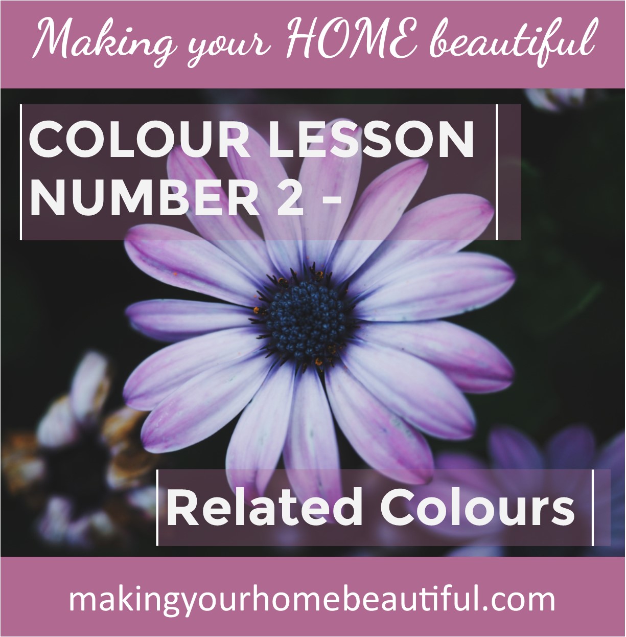
Colour lesson one started right at the beginning with the Primaries and now in this lesson I want to show you the next step. It’s really simple but will demonstrate how easy it is for you to put together a colour scheme that you will love. Hopefully, this is the start of making you less afraid of colour! We are going to look at those colours that sit right next to each other in the colour wheel – this means they are related.
You can of course take just one colour from the spectrum and turn it into a very simple colour palette.
Let me show you…. Monochromatic colour schemes are very effective as they offer a simple straight forward decorating solution.
Take one colour, perhaps a blue, and then add black, white and grey to that one colour in varying strengths. You will find you end up with soft pastels, off whites, cool greys and really dark moody blues and off blacks. You will be amazed with the alternatives on offer and you can manipulate the mood of the space by incorporating either more of the lighter or darker tones, depending upon the feel you want to create.
Related: How to decorate with pastels
The beauty with this is you really can’t go wrong – it's just one colour. I have a related post here: Monchromatic Colour Schemes – Black and White
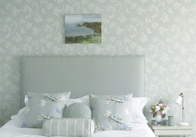
I am a fan of Vanessa Arbuthnot and this beautiful bedroom using her designs demonstrates a pretty monochromatic palette perfectly. The look is light and airy, based on duck egg blue but with touches of white, grey and a slightly darker version of the blue. So you can see that this is one very simple way of finding a colour palette that will work very well.
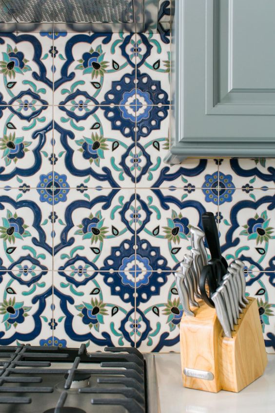
However the next step is to look at a blue and select a colour either side of it, perhaps teal that has quite a touch of green and also a true green colour. This turns the scheme into a related colour palette which takes it one step further as you can see in the image below of these gorgeous tiles.
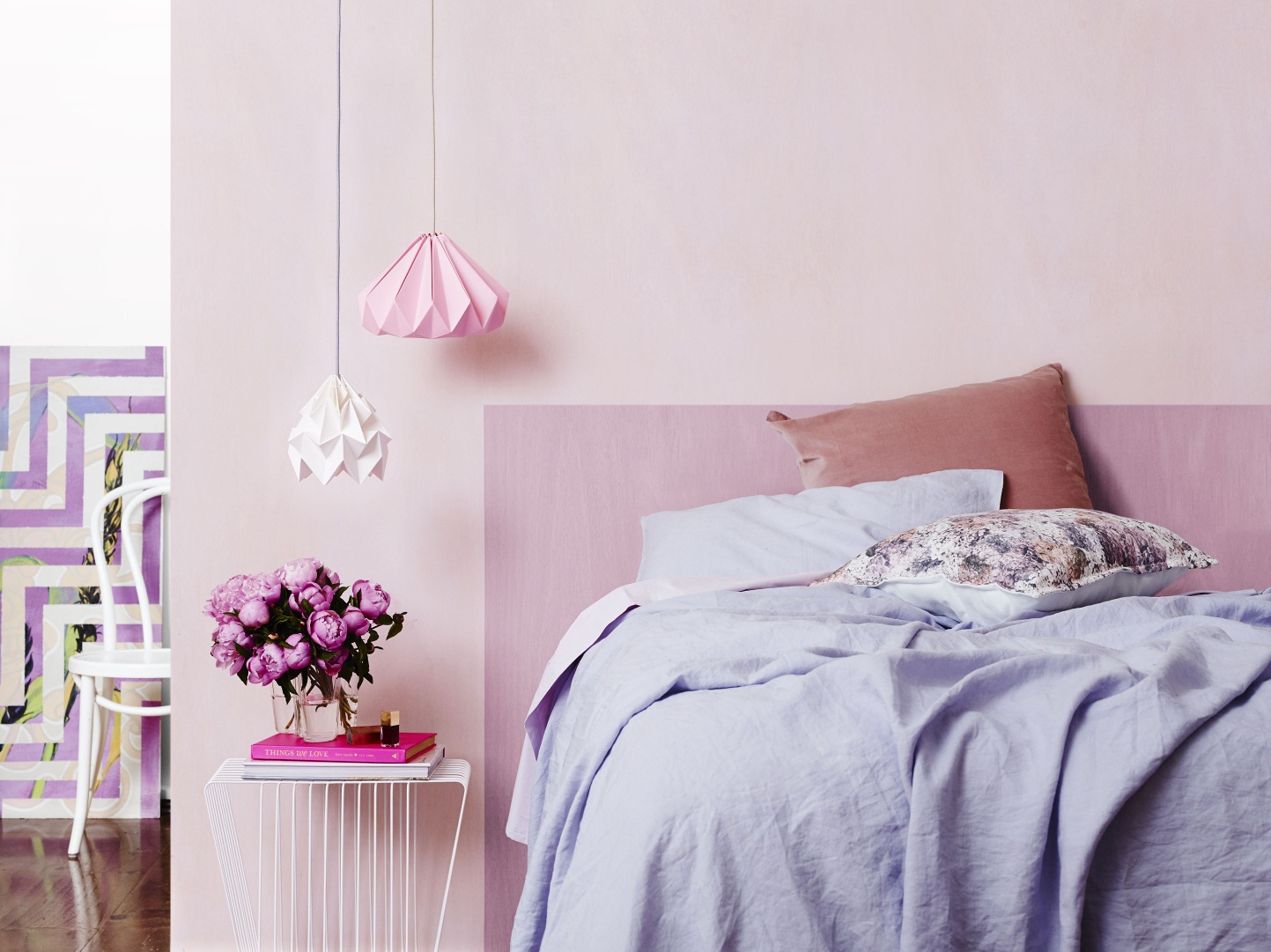
Or you could go in the other direction towards the warmer colours and incorporate a violet or deep purple. Whenever you are feeling devoid of inspiration, remember to look at mother nature. These beautiful feathers sum it up perfectly. A fabulous related colour scheme of blue with green to one side and with purple to the other – perfect!

Once you have a simple related colour palette you can go through the same process that you did when creating a monochromatic palette and add varying degrees of white, grey and black and you will then have the most amazing array of colours to select from for your scheme. It’s simple, but oh, so effective.
The experts have a name for it too – harmonious – which really sums it up. The Carlyle image from Travers at Unique Fabrics is a beautiful example of a simple related colour scheme. Starting with a pale blue and moving towards the cool, lemon based greens. I think this is really sophisticated and carried through with the artwork and accessories really does prove the harmonious point. I would love this room!
My Pinterest boards have lots of colour and decorating inspiration. If you are a fan of simple monochromatic schemes, I have colour boards on the major colours. Once you start to look around, you will see that lots of colour palettes are related ones and once you understand the basics you can see why and how they work.
I hope you have enjoyed reading about these colour schemes and I would love to hear from you in the comments section below about your experience with colour and your decorating problems. Sign up here for my Free Resources Library – I have a great e-book on how to put together a mood board, amongst other resources, to help you solve your decorating dilemmas.
If you enjoy learning about colour and would like to understand it a little bit better then you might like to read the first instalment where I start with the Primaries – the basics and the starting point for all colour schemes.