
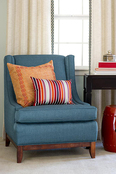
Colour lesson 3 sees us exploring complementary colours. As the words suggest, these go together and are those that are directly opposite each other on a colour wheel. Be careful though, even though they are meant to work with each other, if placed in a decorating scheme in equal proportions, these two colours will fight with each other and the resulting look is over-powering. Basically, the eye doesn't know where to rest. However, if you partner these two colours in an 80/20 mix in a scheme, they look perfect together. Blue and orange are a great example as shown below.
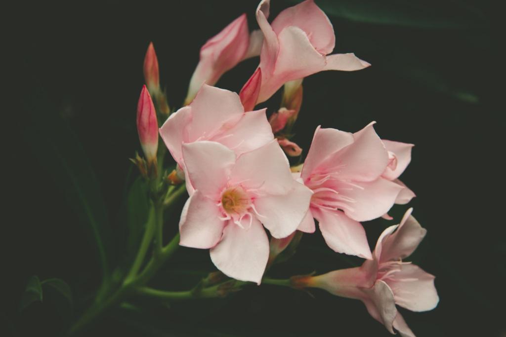
Pink and green are complementary colours and are a classic combination for a country style scheme as this is a partnership often found in gardens and it translates really well into fabric designs and interior decorating. The brown that is made by combining these two colours is a really great neutral that is nether too green or too pink. You will often find these palettes in fabric designs and so if you select the colours from there for your walls, you can’t go wrong. Nature too is often a great place to see how these colour schemes naturally work.
I really enjoyed learning about colour as you hand mix colours and can really start to see how the process works. By mixing complementary colours together you will eventually get a brown of some description but you will also get a whole range of beautiful muted colours along the way that work really well for interiors.
For example, if you have a bright hot magenta pink, its opposite complementary colour is a cool green which contains slightly more yellow than blue. Once you start to mix a little of the green into the pink you get a wonderful dusky berry colour which will eventually turn into brown as you add more green. You can then tint these colours with white and you have a stunning colour palette that you know will work together in a decorating scheme. Therefore when you see a decorating scheme that just seems to work, it is quite likely that it has been put together following these colour rules.
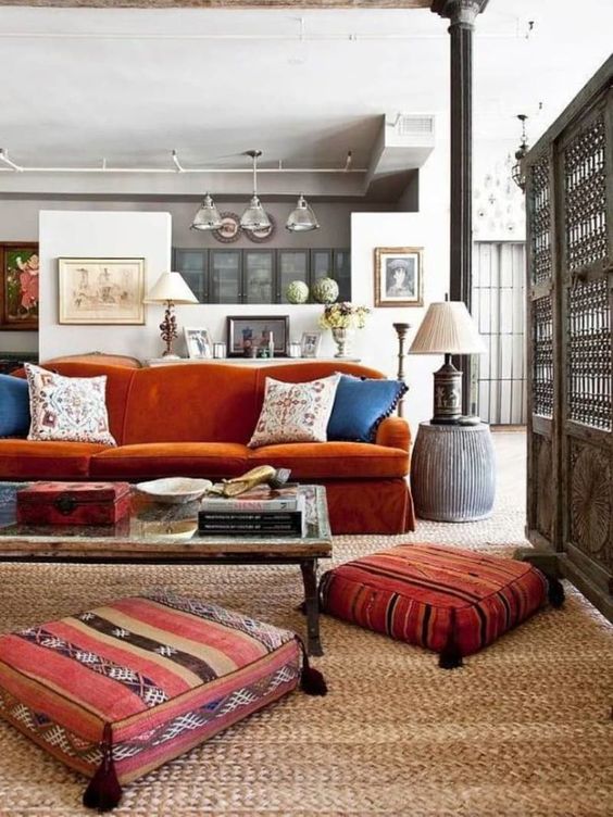
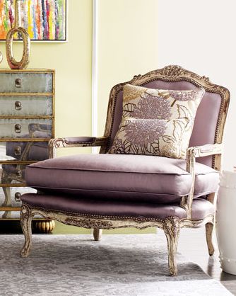
Going around the colour wheel, the third classic combination is yellow and purple. It doesn’t matter which colour makes up the 80% in the partnership, just as long as one of them does and it could be that the major colour is actually quite muted or pale, for example a very soft creamy yellow off white could be partnered with accents of purple or lilac. Or a crisp white with a modern blue undertone could be used with navy sofas and a bright orange accent chair.
So, I hope that this has shed some light onto how complementary colours work together. My Pinterest boards have lots of colour inspiration and I would love to hear your comments in the section below.
