
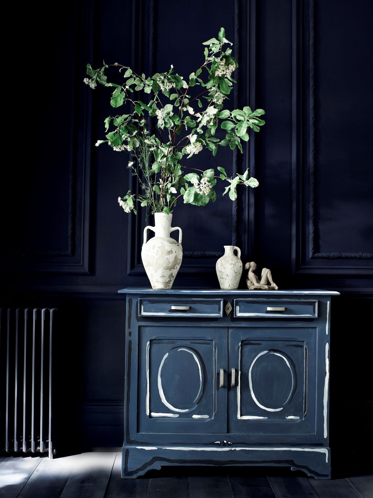
People tend to either love or hate a dark colour palette. Those of us who do like them though are often too afraid to use them and the alternative of a light white or neutral scheme just seems an easier option. Certainly, this can be true but often it isn't the case of selecting either a light or a dark scheme for the whole house, I believe that there are certain areas of a home that are ideally suited to an intimate and moody colour scheme whilst other areas benefit from crisp white finishes.
Always consider the MOOD you want to create, the ASPECT of the space and WHEN you usually use the area. This will help you to determine whether you can get away with a dark colour palette, which when used properly, will inject personality and style and will be a place you will gravitate to.
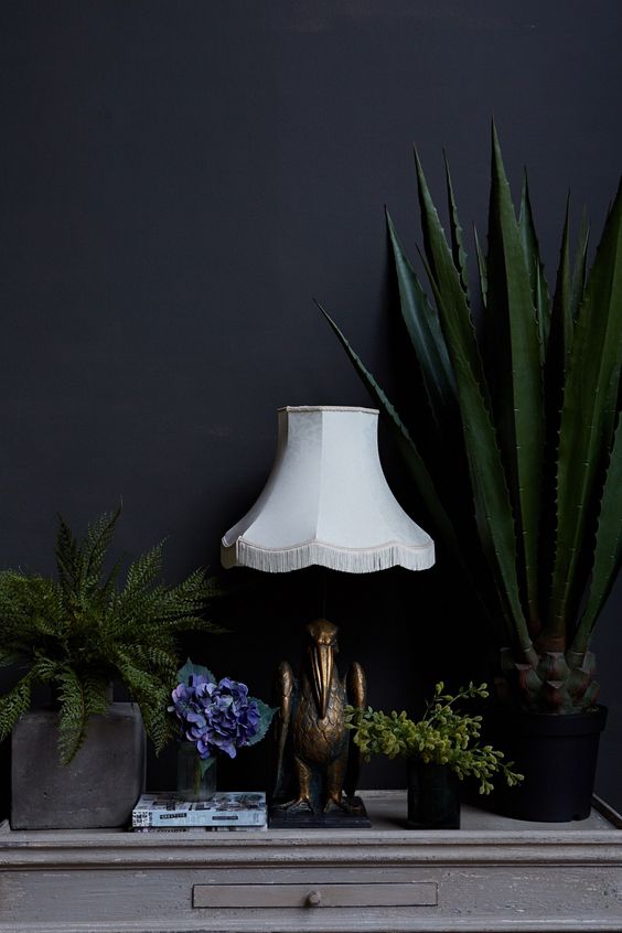
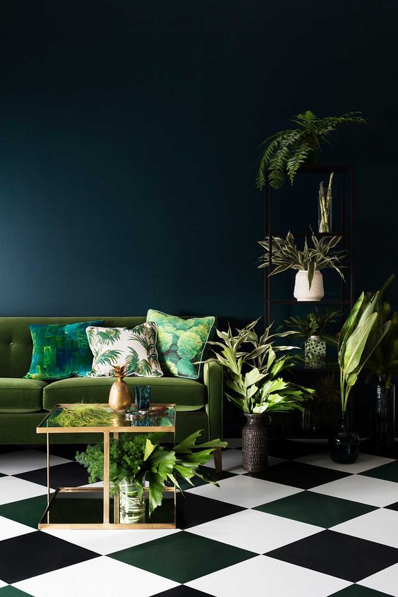
The UK's Abigail Ahern really made these beautiful dark colour schemes fashionable. She embraces the dark side and her decorating schemes are instantly recognisable. Her use of layers of deep tones are inspired and she has created a certain style that has her name all over it. Her use of greenery and floral accessories in her schemes is a signature element, which really brings alive this moody style.
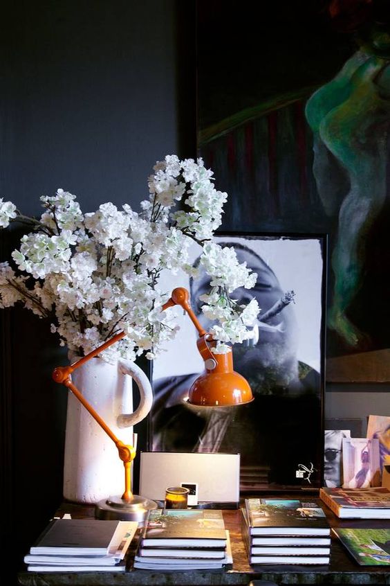
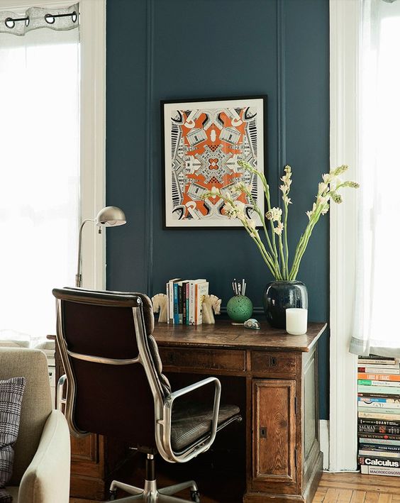
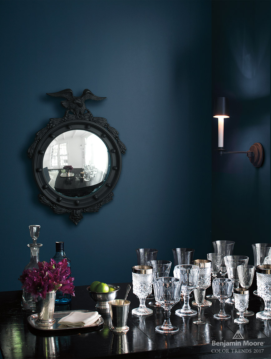
The appeal for me of a dark wall is that it provides the perfect backdrop to highlight anything placed in front of it. These white flowers come alive in this image and artworks are also very effective when hung on a dark wall.
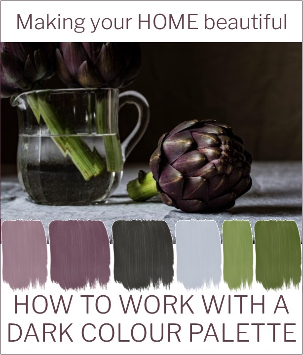
If you are stuck for inspiration it is a good idea to find an image that you love. It could possibly be an artwork that you already own or simply a gorgeous still life photograph. I found this one above and then extracted the colours from it and created a gorgeous dark colour palette. With the off black as the grounding neutral and the pale grey as the light relief, the addition of complementary colours in pinks and greens become the highlight of the scheme.
Related: Complementary Colour Schemes – Lesson 3
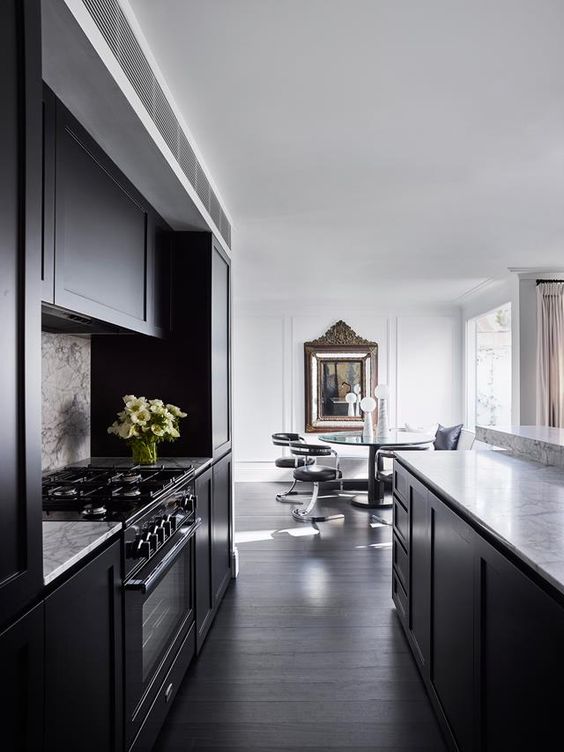
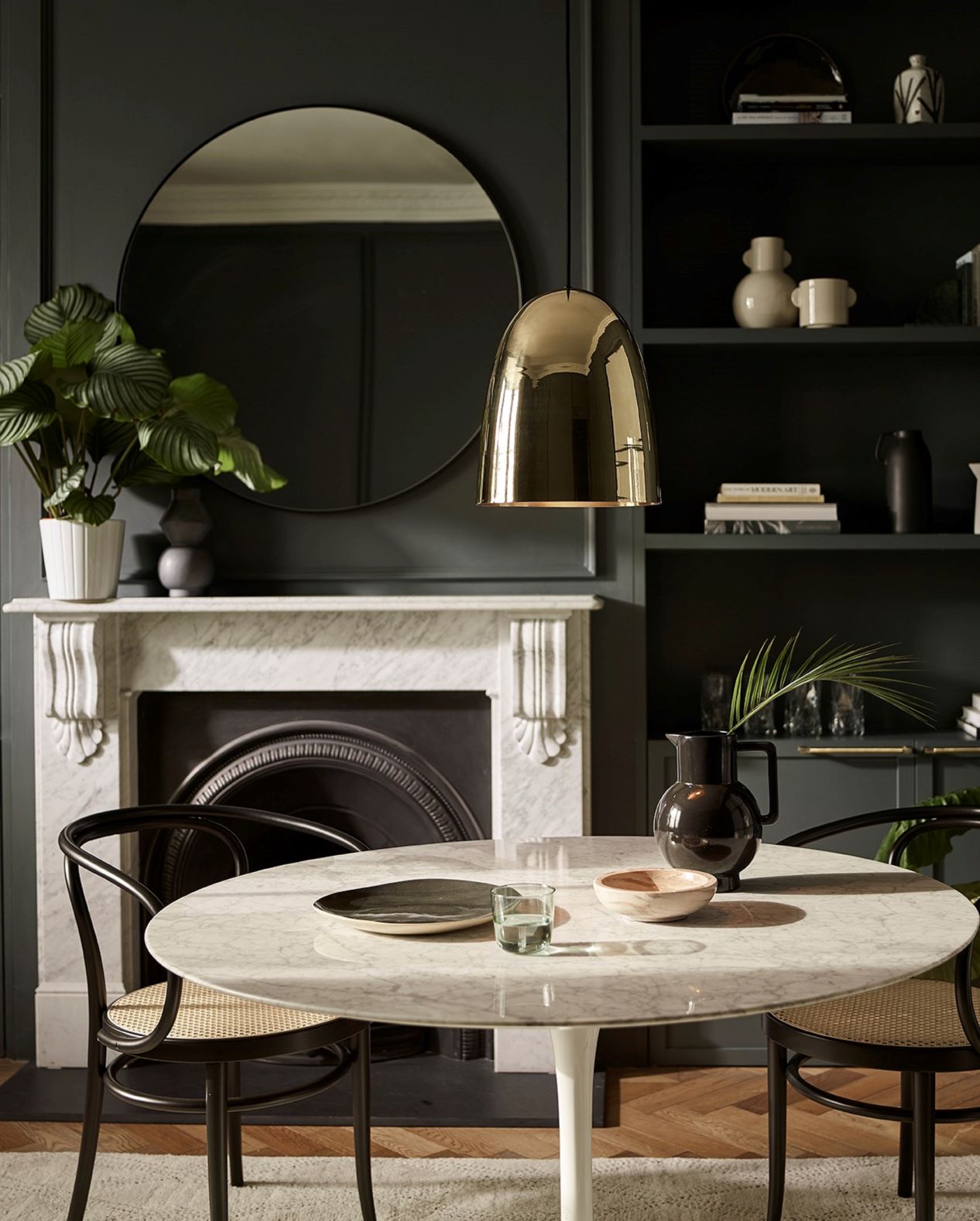
In large open plan spaces, dark colours can also be used to zone an area. In a classic interior, a dark kitchen looks more in place and ensures that the living area is bright and light. The strong tonal variation gives a timeless and classical feel to the space.
Related: How to use black for kitchen cabinetry
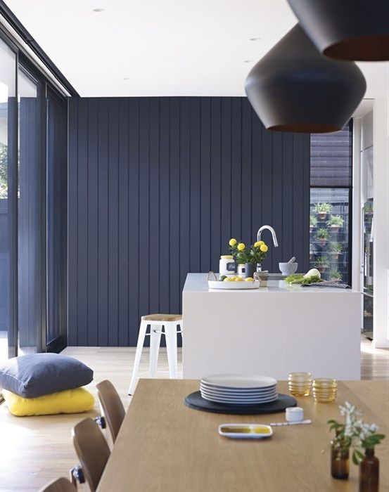
It is often considered that to achieve a relaxed coastal style look you need to decorate with light, white and breezy colour schemes. However this rich dark interior wall in a charcoal blue, which cleverly links to the exterior, brings a dramatic and moody touch without losing the coastal vibe.
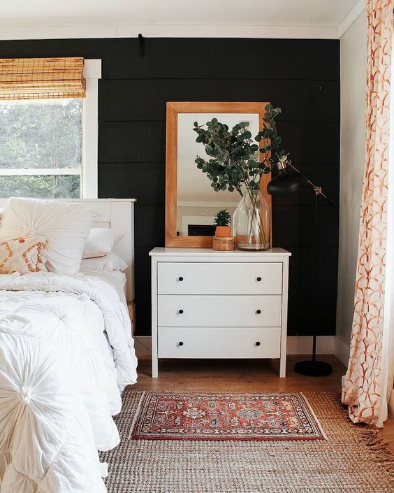
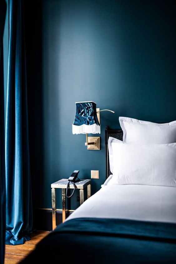
I also like to use a dark colour palette in a bedroom as I find them very restful and again they are a simple backdrop to fresher and lighter colours.
I personally love these colour schemes and used a very dark grey in my living room when I decorated over ten years ago. I love it as it has created a beautiful serene environment and I would love to see more people using these gorgeous deep hues.
My top tips to help you create a dark colour palette
If you feel you have an area in your home where you could use a colour scheme like this then I have a few tips below to help you:
- Dark tones can either be offset with a lighter trim, usually an off-white, or you can use the same dark colour for your trim. It will depend upon the mood that you want to create, so if you are looking for the richness of the darker colour, but want to offset it so that it isn't too brooding, then an off white trim is the way to go. If you want dark and brooding, then omit the white trim.
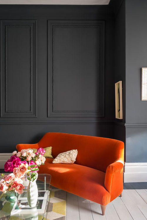
- If you love the darker grey hues but find them too oppressive, then in addition to partnering with a white trim, you can also inject a splash of colour. The orange sofa in the room above is the focal point and colour in the room and the grey wall is simply a dark neutral that recedes into the background.
- Dark tones used on just one wall can close the space in, however when used on all four walls they appear to recede as you lose the definition of the corners. Rather than make the room appear very small, using dark colours like this will just make the room cosy and intimate.
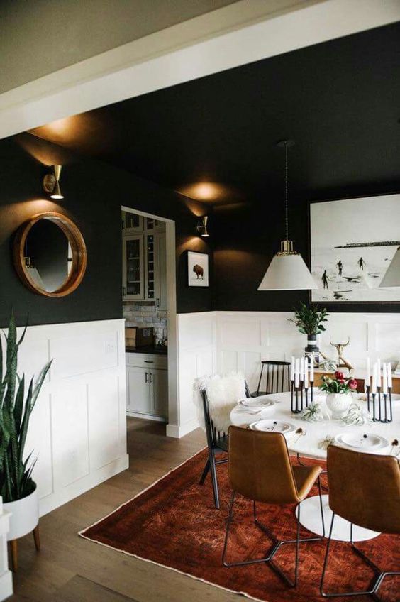
- Dark tones are an excellent choice for dining rooms that are used predominantly at night time as rooms decorated like this come alive with the right lighting. Use a combination of wall lights, table lamps and some overhead lighting from feature pendants. A clever lighting plan to complement dark colours can work amazingly well.
- The introduction of mirrors too adds another dimension and helps to reflect light around the space.
Related: What colour do I paint my skirting boards and architraves?
Strong dark colours can also be used to manipulate a space too. Using the off black on the walls and ceilings will lower the height of the room and make it feel more intimate without closing it in. This is a very clever use of colour and tone as you have a light and airy feel but the space seems intimate and cosy too.
If you want to find out more about manipulating space with tone and colour, my colour lesson 5, gives you a lot more background and inspiration:
Related: Manipulating a space with colour – colour lesson 5
I hope this has inspired you to consider the use of dark colours. Remember when decorating, it is often about the mood you want to create rather than the depth of colour. Consider this before you even start looking at paint charts.
Let me know in the comments section below if you plan to use a scheme like this – I would love to hear how you go.
Like the idea of using black and white together? I have more information in this post:
Related: Monochromatic colour schemes – Black and White
You should always start an interiors project with a mood board. I have a free e-book in my Free Resource Library for you to download which guides you through how to put a mood board together. I also have lots of other comprehensive checklists and e-books to help you with your next new build, renovation or decorating project.
I also offer online colour consultations for those of you who are stuck with finding the right colour or finish for your home. Find out more here.
Hi Samantha,
Interesting article, thanks for writing.
I’m selecting colours for our home theatre. Room size is 6.2m long, 4.2m wide. Ceiling is coffered with height of 2.7m. Windows will be blocked off to make the room dark. The wall behind the screen will be a dark grey to avoid affecting colour perception while viewing. For other walls, we are thinking perhaps a dark burgundy. Not sure what to do with ceiling and the coffer surrounds.
Would appreciate any thoughts you may have.
Best,
Geoff.
Hi Geoff generally for a home theatre I would recommend a darker ceiling to get the best experience but it depends on how far you want to take the whole home theatre experience. You could alternatively opt for a soft white, particularly if you already have this on the interior door and trim. Remember too that you should use a paint with a very low sheen or matt finish to avoid any light bouncing around the room. Hope this helps Samantha
Thanks Samantha, this is helpful.
Hello. I am wondering if it will be okay to use dark colors on my study area. I am also thinking of using black on the study table to compliment the dark wall
Hi Jane you really need to consider the mood that you want for your study area. Dark colours can be very restful and cosy but without much other relief can make a room depressing. So you have to think about the mood you want to create and consider where you can have some light relief if you feel the room will benefit from this. A dark desk can look really smart and there is no reason you shouldn’t match this to the wall. Just be sure you like the idea of this dark environment for your study and remember that lighting will be very important – particularly task lighting. Good luck Samantha
Hi Samantha, great article on the use of dark colours. We are currently renovating a federation home, we have a living room off from the kitchen which when we bought had dark colour on the wall, it created a very cosy feel especially as it has an open fire place (v cosy in winter) we are looking to keep the dark walls (looking at obsidian from Porters Paints or similar) but will also have built in joinery on either side of the fireplace. I’m struggling with what colour to do the joinery, I was leaning towards a white (lexicon 1/4?) but was wondering if it would create too much contrast against the dark walls? You can see the kitchen (which will be white with marble island bench) from this living room, wondering how to make the colour scheme flow between the rooms. I’d love your thoughts on what colour the joinery should be. Can I leave it as white? Thank you
Hi Chrissie You can have a strong contrast – it makes a big statement but will certainly work and if you are planning on using Lexicon Quarter for your kitchen then it makes sense to carry this through. Consider all the trim throughout this area and the colour of marble that you plan to use. It could be that another white which is a little softer could work too. I would treat it as one area and then decide but there is certainly nothing wrong with the joinery in white. Good luck – it sounds stunning. Samantha
Hi Samantha, in my new home I have a formal open style living room where I will place my soon to be painted 2.7m French style bookcases. The room has wainscoting in Dulux Lexicon 1/4 running along the walls (1.1m high) which is a continuation from the entrance hallway. The paint colour on the walls is Dulux Llytleton 1/2. The French doors and windows on the opposite wall to the bookcases are also white. The bookcases will be painted in Porters Yacht Race. The other blue elements in the room are a large navy border on the bottom of the curtains and a red & blue Persian rug I’ve had for many years. The floor is a chocolate colour. I’m pretty certain the room will look lovely. I’m happy to say that the paint colours I’ve used for the exterior and interior have been your suggestions Samantha, and I thank you very much for that.