Have you heard of Millennial Pink?
Have you noticed the resurgence of the colour pink? It is now being referred to as Millennial Pink and has been made popular again by those Generation Ys amongst us. Young people have embraced this beautiful colour and I am glad to say that it is popular with both men and women and no longer left just for use in a little girl's bedroom scheme.
Millennial Pink is now front and foremost in contemporary style decorating for living, dining and bedrooms. Instagram pages are full of beautiful pink imagery with vases of peonies at every turn. The key is knowing how to use it and the other colours to partner it with.
Remember there are no new ideas, just different ways to use them. I really love to use Millennial Pink with black for sophistication and white for a contemporary crispness. Let me show you how.
Nature is a major inspiration in the current love of Millennial Pink
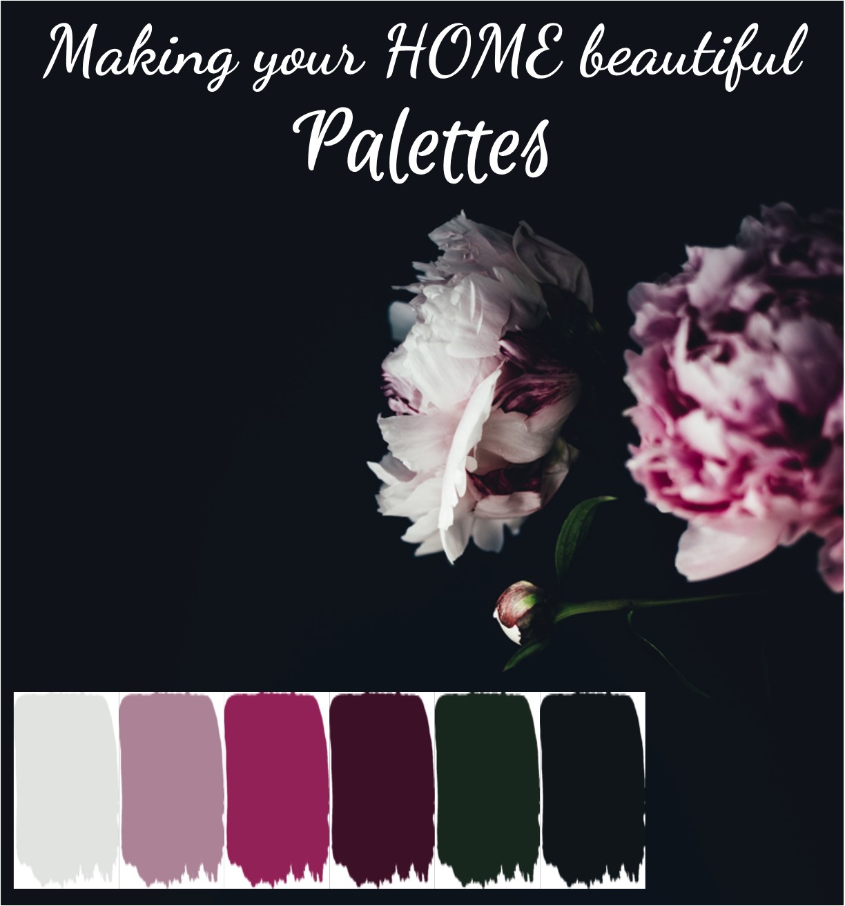
I like to get my colour schemes from nature and fell in love with this photograph by Annie Spratt. The addition of the black background here for this beautiful photo adds a new dimension to the pink. The black really defines the edges and makes the colour pop.
Black is a very useful tool for bringing sophistication to a scheme and it also ensures there is a contemporary edge to the palette which makes it really great to use for interior decorating.
Millennial Pink mood board
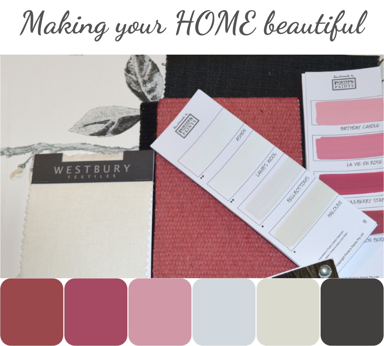
Once I found this photograph I started to play with putting together a colour scheme for a project. This is the mood board I created which I think will translate really well into an interior scheme. Remember that you don't have to incorporate everything from a mood board as they are simply great inspiration to help you to achieve the look that you want.
You can also incorporate some beautiful greenery in the styling and use predominantly black and white with just an accent of pink, which could simply be an artwork.
Millennial Pink inspiration
I have found some really beautiful inspiration on the internet which I hope will persuade you that pink is a colour to look out for, whether you are one of the Millennials or not, and to start taking seriously again.
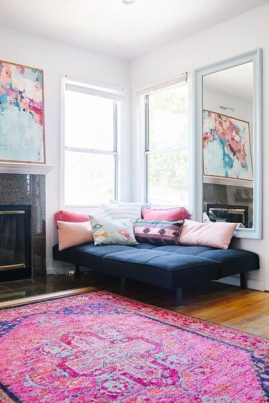
Uplifting and happy, this room is grounded by the stunning pink rug but the look is tempered with crisp white walls and trim and black accents.
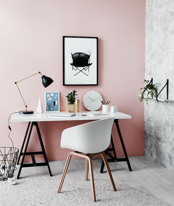
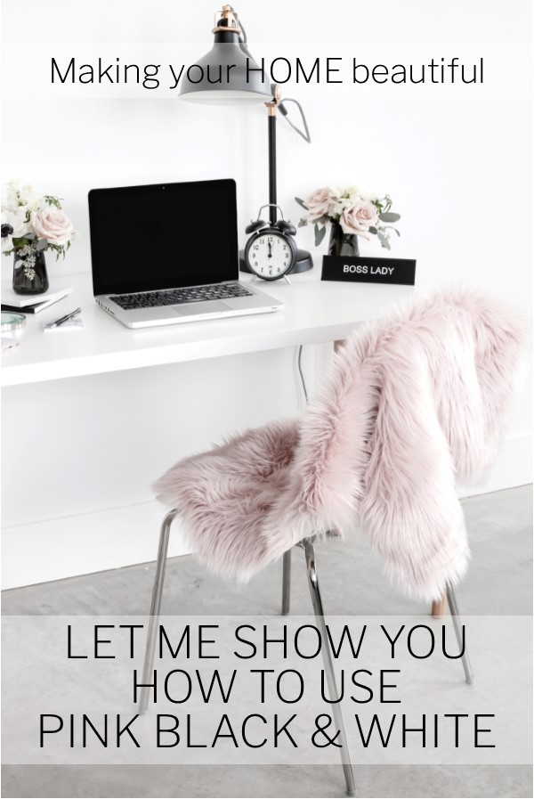
Pink, according to colour psychologists, is the most comforting of the colours in the spectrum. Pink is aggression inhibiting and lovers of this colour usually have money and a good education. A great colour therefore for a home office! Tempered here with black and white, the colour is pretty yet sophisticated. A fabulous Millennial look.
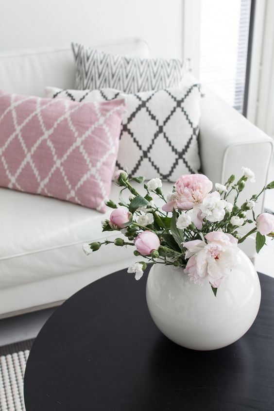
Just an accent of pink in a contemporary monochromatic black and white colour scheme is enough to give the room a lift. The addition of pink here brings a touch of femininity – imagine taking this away and the look could be quite flat.
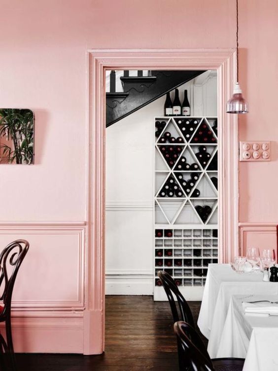
Vogue magazine ran a really interesting article showing the Pantone colours of the year since 2000. Rose Quartz was the colour for 2016 and I believe really launched the revival of pink for interiors. Used here in this restaurant with contemporary black and white, the result is very effective.
The Pantone colour for 2019 is also pink inspired in Living Coral. Described as an orange it also has a dash of pink. You can read more here:
Related: Pantone Living Coral – How to use it in your home
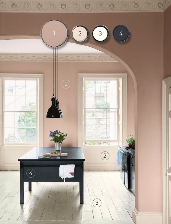
If you want a more subtle and natural look then a greyed down clay pink like this one from Farrow & Ball could be the answer. Teamed here with a dark grey, almost black kitchen, the look is soft but refreshingly different. These pinks are often referred to as a salmon pink and can be very useful for heritage style decorating.
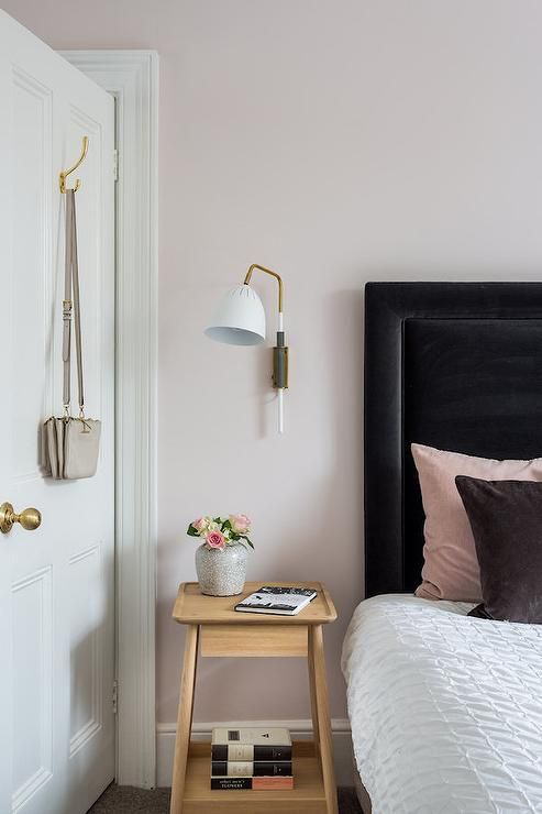
A softer pink again, this is an ideal colour for a bedroom and is almost an off white. Partnered here with a masculine style bedhead and crisp white bedlinen, this is a bedroom that would appeal to both men and women and the pink on the walls certainly provides a beautiful relaxing space.
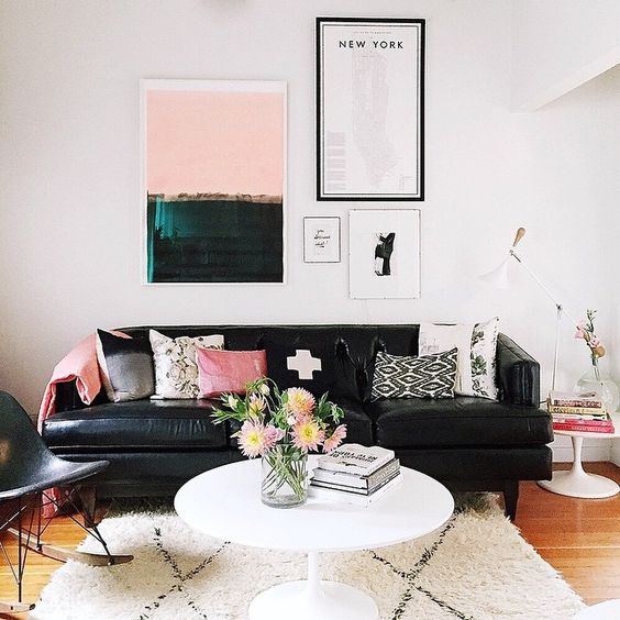
Again, here is a masculine style monochromatic black and white living room that has been brought alive by the injection of pink in the accessories and artwork. This doesn't make it a feminine space, it just softens the look and makes it more inviting. There is no doubt here that the strong lines and tonal variation of the neutral scheme is the backbone of the look but the pink really does pull it together.
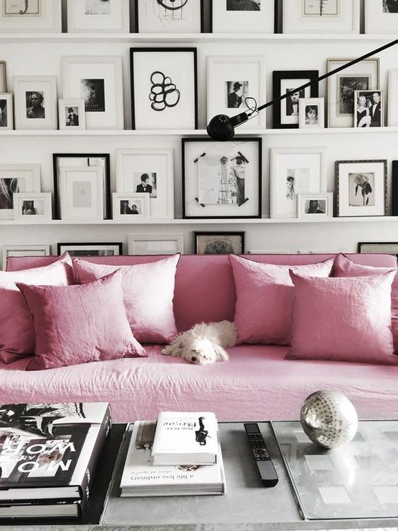
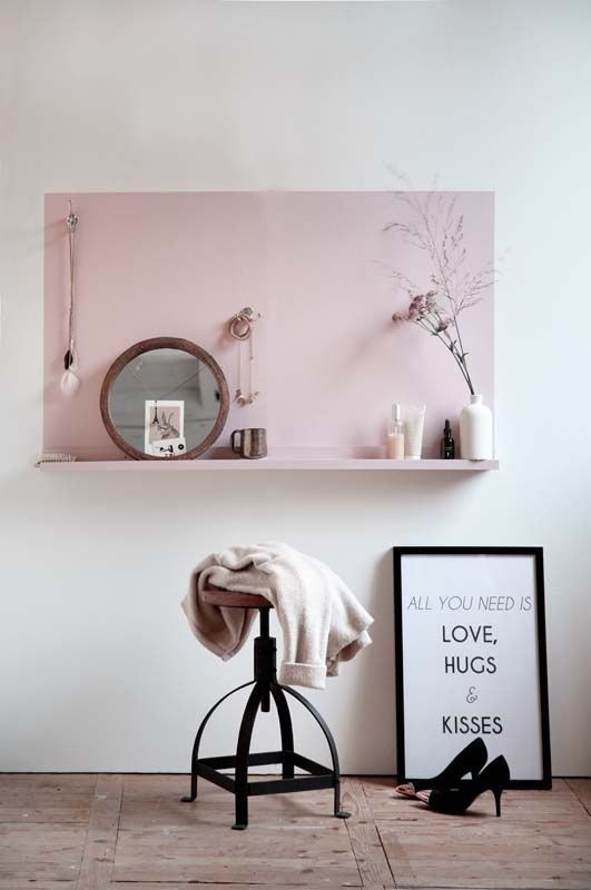
If you are in doubt about using pink in a scheme then you may want to consider using it as a block colour rather than as smaller accents. This does make a pink statement but it also makes a very contemporary one and prevents the look from being too fussy. Yes, it's pink, but it is modern and stylish and I think looks fantastic with this black and white scheme. The feature wall of black and white framed artworks really is the star of the show and the dash of pink balances it all nicely.
I have a board dedicated to the colour pink on my Pinterest site and I would love to hear whether this is a colour that you would consider using in your interior decorating schemes.
Remember pink can come in many guises, a strong pop of colour for a statement or a natural almost earthy pink for a heritage wall colour. Even a pink that is almost white can completely change the mood of a space and make it more appealing.
If you love the colour pink, you may also like to read another article I have written about this beautiful colour:
Related: Let me show you how to use Pink in an interior scheme
Love pink but just want to use it as an accent in a predominantly white scheme? Then you might like to read my post about the 5 mistakes to avoid when selecting white. This will help you to find the right white palette to accompany pink.
Related: 5 mistakes to avoid when selecting white
And if you need more background information then I have this post too:
Related: How to find the Right White

