
The modern day buzzwords of eco sustainability are now firmly entrenched in day to day living and designers are often asked to create designs which integrate well with the natural environment. When considering the environment it is the colour green which you often turn to, however other neutrals which are completely at one with nature make up a classic natural colour palette.
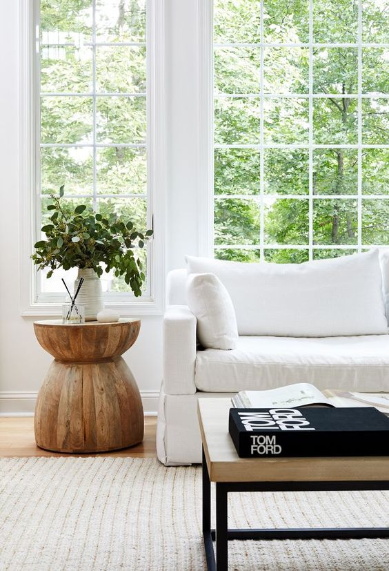
A beautifully serene scheme can be created with the coastal hues of driftwood, rope, pebbles, sand, oysters and chalk with hints of green and brown. Rather than any strong colour taking centre stage it is the natural elements of these items that bring texture and interest to the scheme and in fact the addition of any other colour in this palette would detract from the natural calming beauty of the scheme.
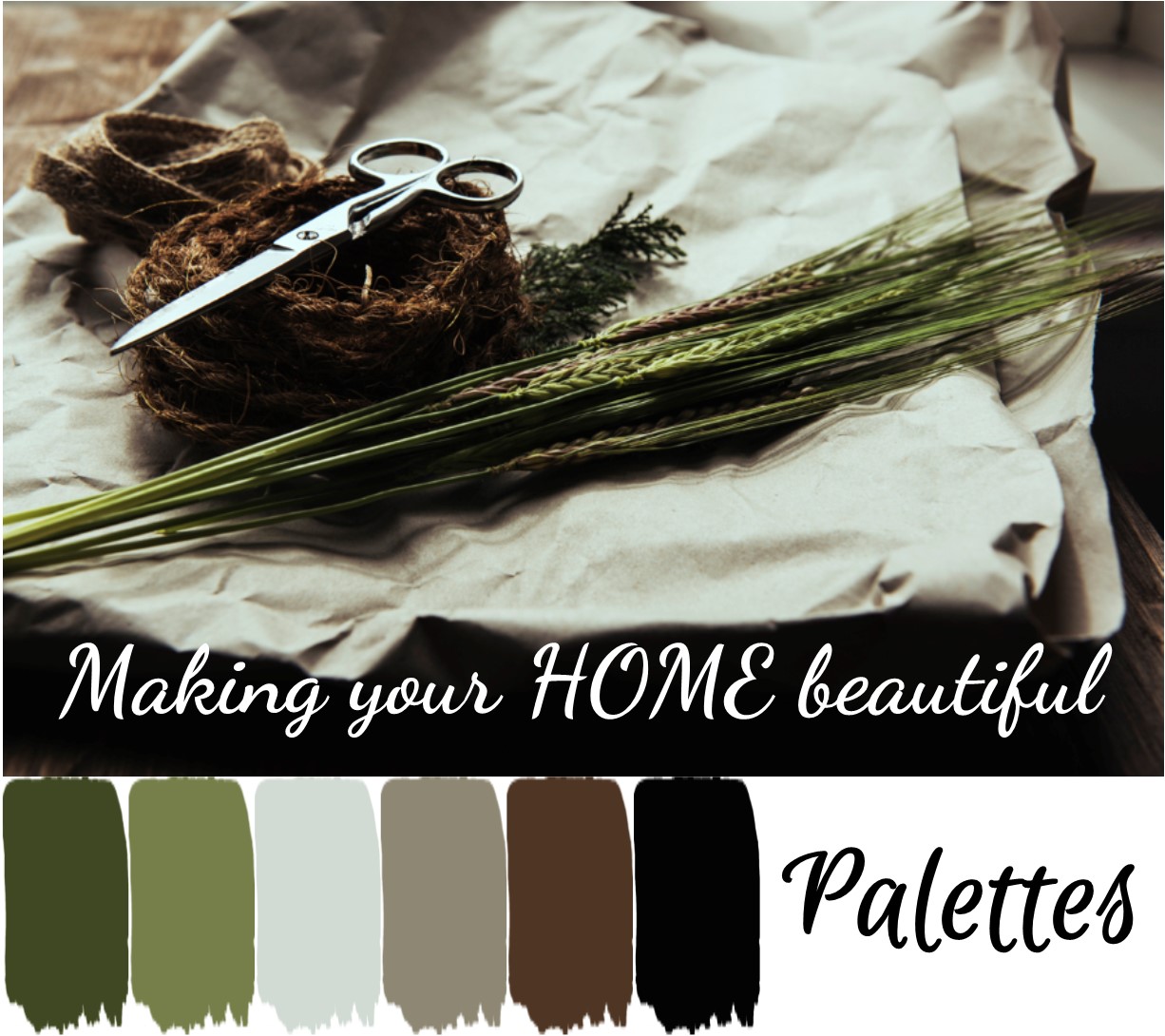
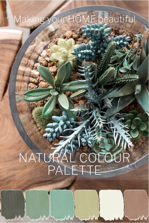
I love to find inspiring images and this one caught my eye as a beautiful basis for a modern natural palette.
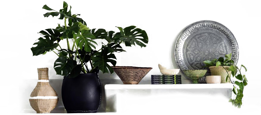
This palette would work well for the current Botanical trend and the popularity and wide appeal of green. With artworks framed in black against a neutral stone wall, the look is on-trend, simple and stylish. It is great to see how a lovely vignette inspired by the potting shed can create such a beautiful interior colour scheme.
The HEX numbers for these colours are as follows (take these to any paint store and they can mix the colour for you)
Hex ef4723, Hex 767e4a, Hex d1dbd3, Hex 8e8773, Hex 4f3523, Hex 030303
How to translate a natural colour palette to a decorating scheme
I have found some fabulous images which I think would go really well with this palette:

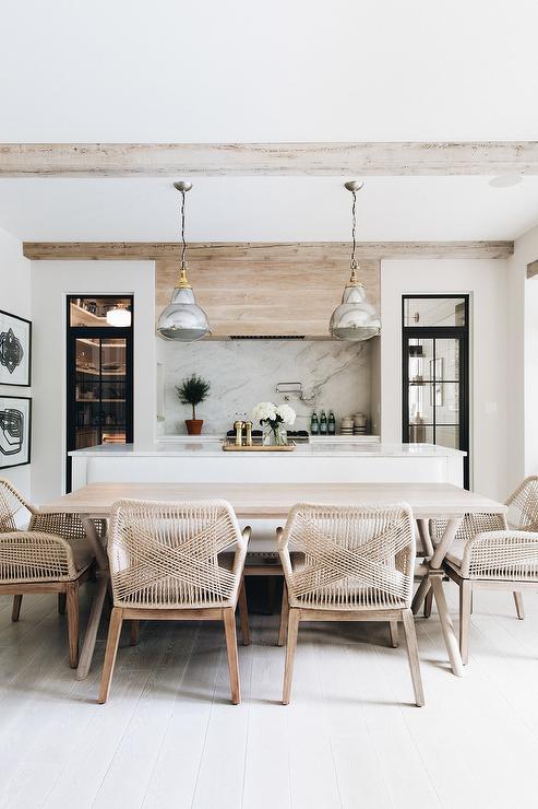
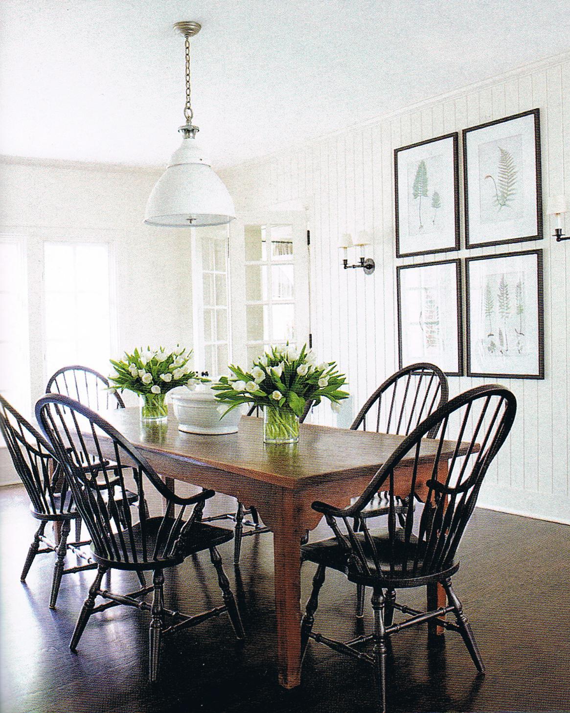
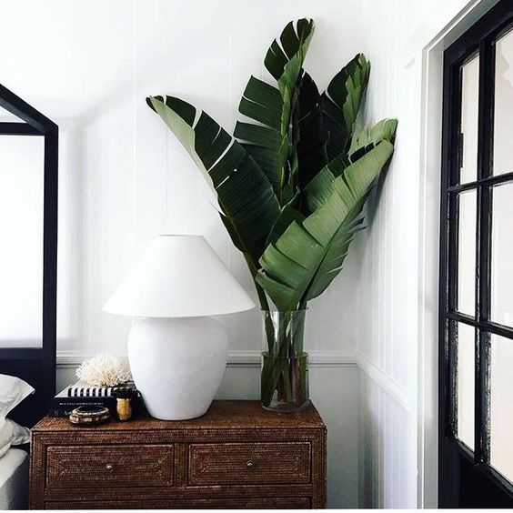
The room above has a classic coastal feel without a scrap of blue in sight. However, the gorgeous dining room with Botanical prints and fabulous Windsor chairs below evokes more of a country style look.
A lovely vignette can be created using this natural colour palette which would be completely at home in a classic Boho scheme.
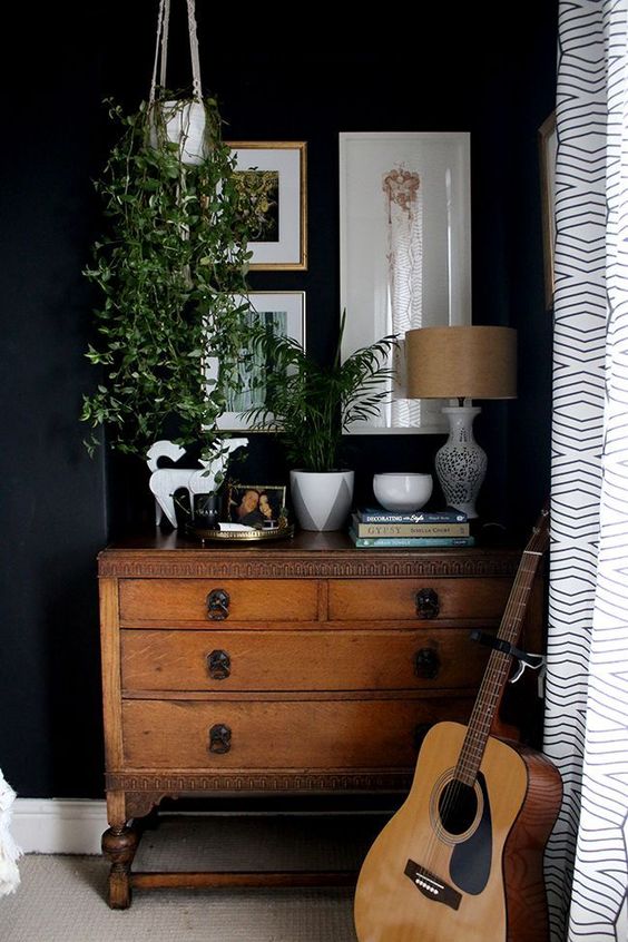
I absolutely love this gorgeous dark and moody corner in a bedroom which fits this natural colour palette perfectly
The Botanical Trend in all its glory! What a great way to style a room.
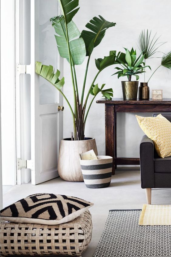
Rugs and cushions in black and white with crisp white walls are brought to life with the touch of Greenery. This is a classic natural colour palette.
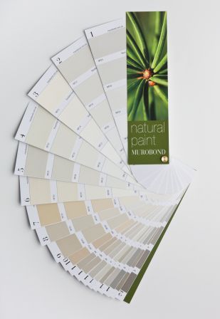
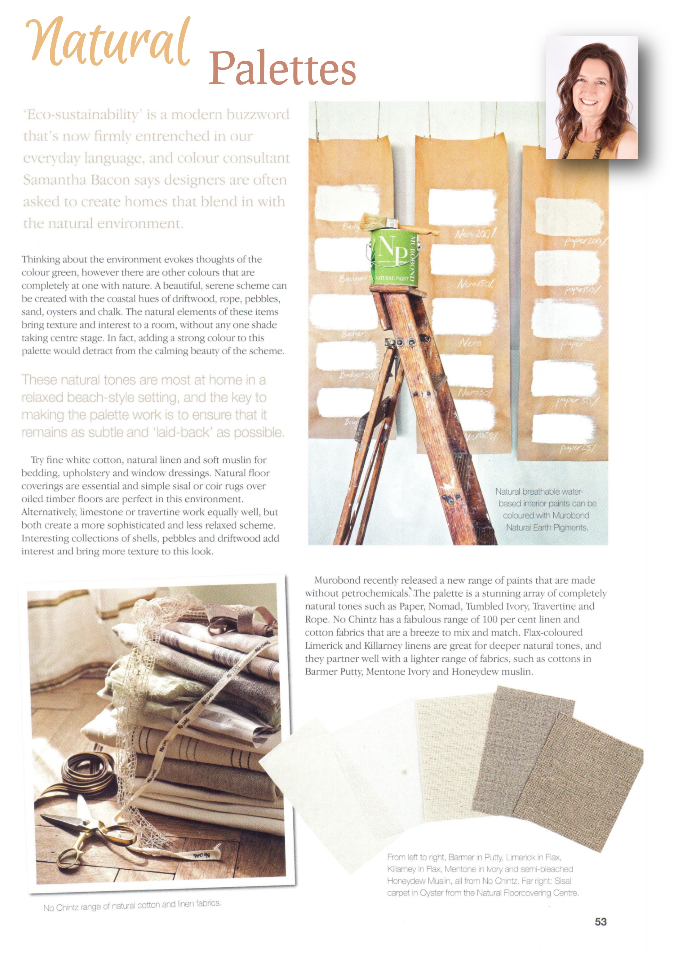
If you like the idea of a natural inspired palette, you may also like the idea of using natural paints.
Natural paints have a depth and quality that is different from the mainstream paint on the market as they are formulated without petrochemicals. When tinted with natural pigments the colours are soft but complex. With a beautiful matt finish they are great for interior walls.
The Murobond range of natural paints, shown below, demonstrates the lovely muted colours that would work so well in this type of colour scheme.
I wrote about how to use natural colour palettes a while ago in Modern Home magazine – the full article is below.
Whether you love the Botanical trend, are inspired by Pantone's 2017 choice of Greenery for Colour of the Year or just love all things natural, this is a colour palette that you really can't go past.
Don't forget when you look at greenery that it often has a blue/grey tinge too. This palette shows you how you can use a subtle duck egg blue in a classic natural colour scheme too.
Related: Styling with Eucalyptus
My Pinterest board, Interior Design with Greenery, has heaps of inspiration. I have boards on all the colours, including the beautiful neutrals of white and black – hop on to take a look and let me know your thoughts and comments in the box below. Look forward to hearing from you!
If you love the greenery trend you may like to read my article about finishing a room with greenery. Many have this beautiful colour palette and there are lots of ideas if you love the Botanical trend.
Related: How to incorporate the greenery trend
The contemporary Bohemian look and the classic British Colonial Style also rely heavily on this natural colour palette. You can read about these here:
Related: 4 key elements of Contemporary Bohemian Style
Related: British Colonial Style – 7 steps to achieve this look
My final word! When you design any colour palette or an interior decorating scheme you must put together a Mood Board. I have a FREE e-book guide showing you how to achieve this. You can download it here Free Resource Library.
Hello Samantha,
I hope you can help me, I need some guidance in helping my elderly mum choose an interior paint colour for her home.
I think it was built in the 1920s. The interior still has most of its original features such as dark timber doors, skirts, architraves, window surrounds, picture rails as well as decorative cornices and ceiling, plaster walls and timber floors.
The house doesn’t receive a lot of natural light, except for one bedroom that receives westerly sun in the afternoon.
Due to the dark timber everywhere and lack of light, I was thinking of greens such as Dulux China White or Ecru?
I would so appreciate your thoughts and suggestions.
Regards
Lee
Hi Lee I think that I would opt for Ecru over China White as it has a little more depth to complement the dark timber elements. If you wanted something slightly more green you could look at Dulux Handmade Linen or Ghostly Green. Good luck Samantha
Hi Samantha,
Thank you so much for the reply and advice.
I will definitely try Ecru then and will also look at the other colours you suggested.
Regards
Lee